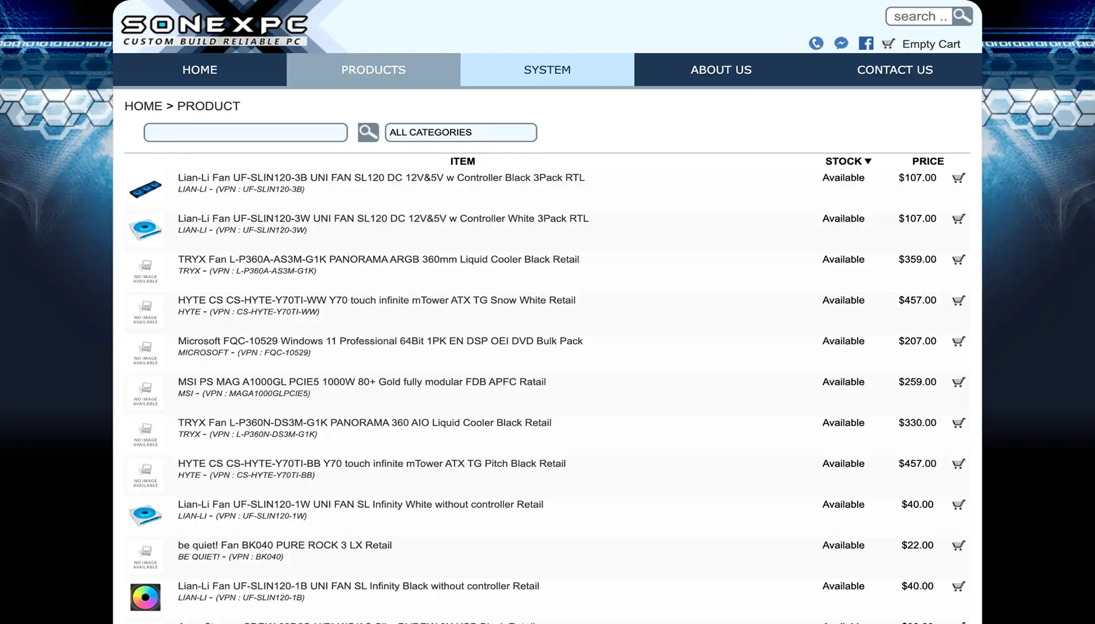
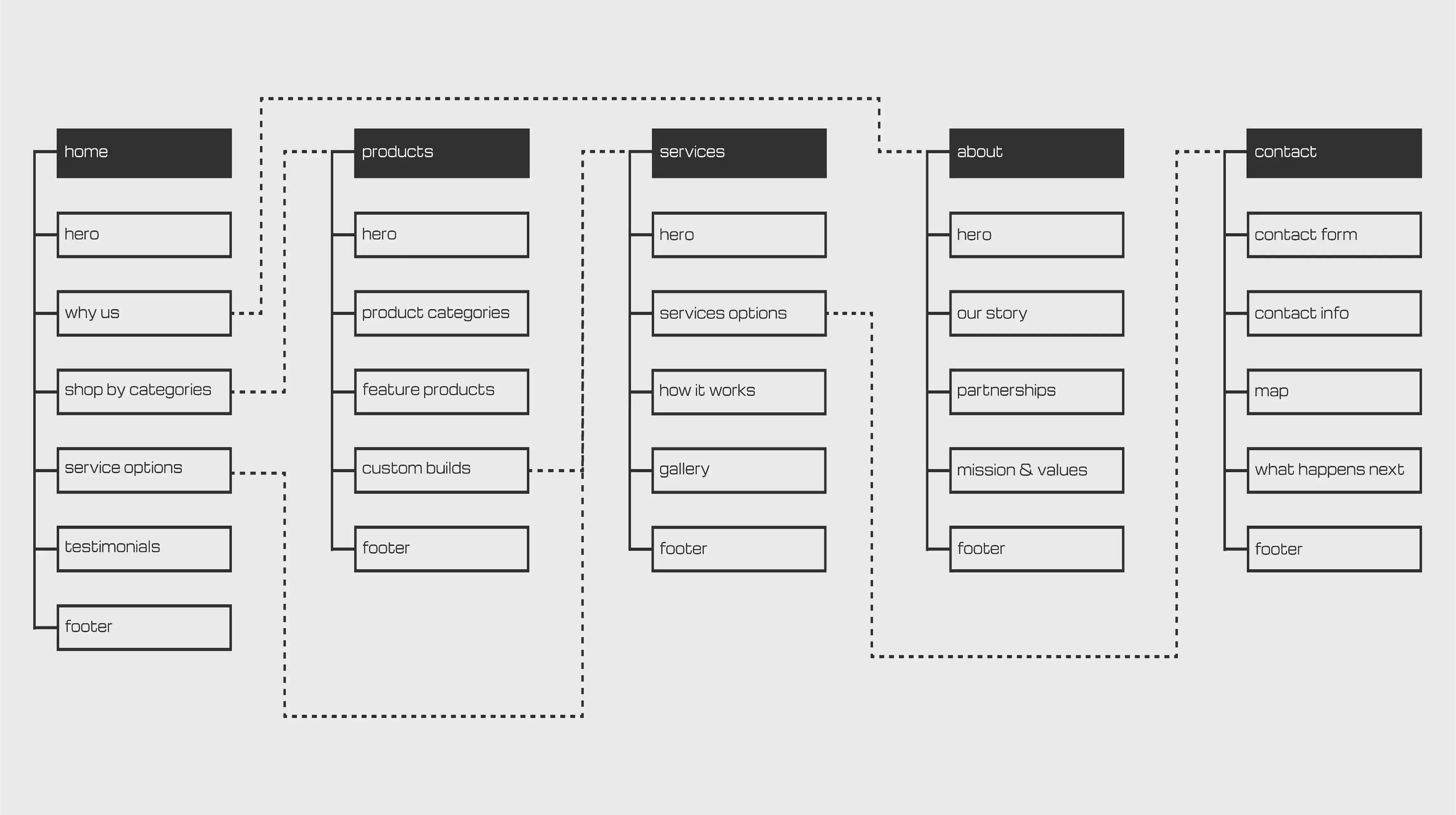
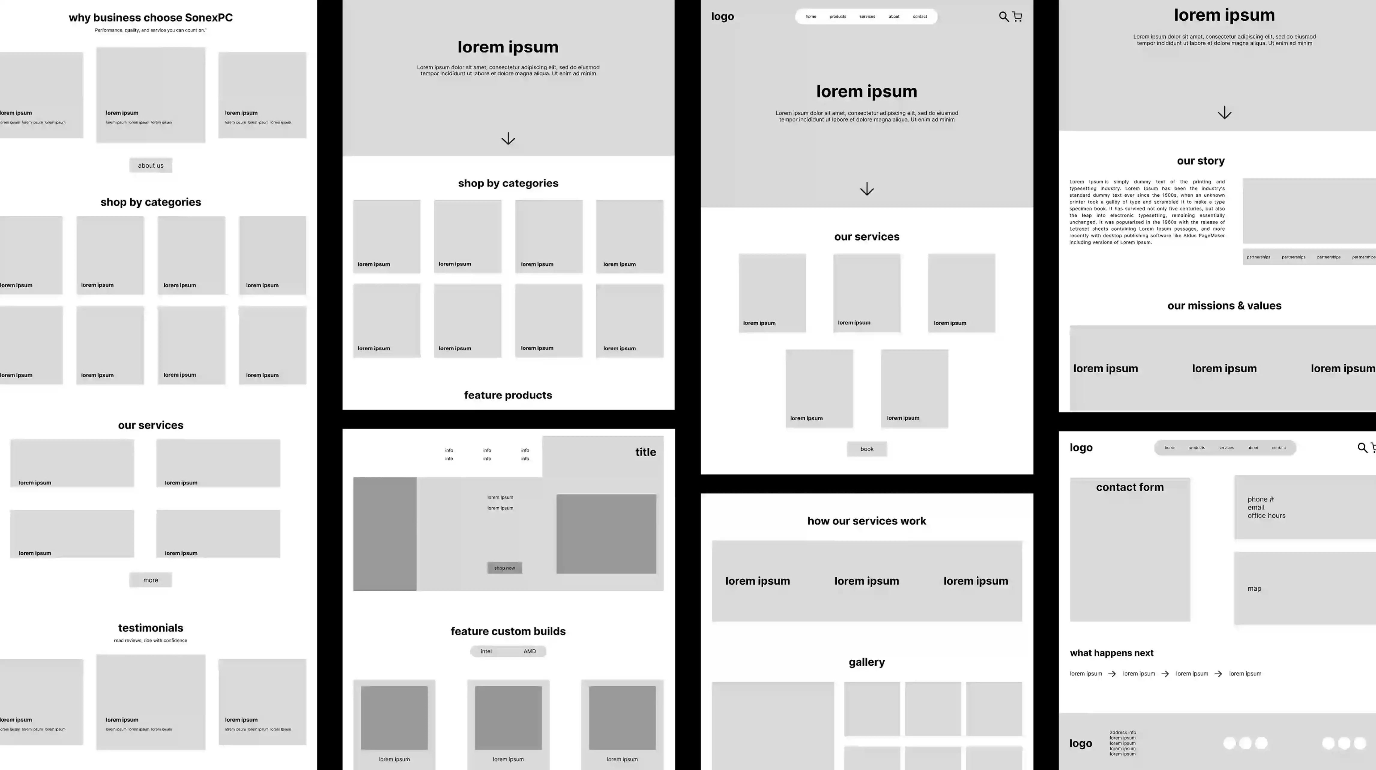
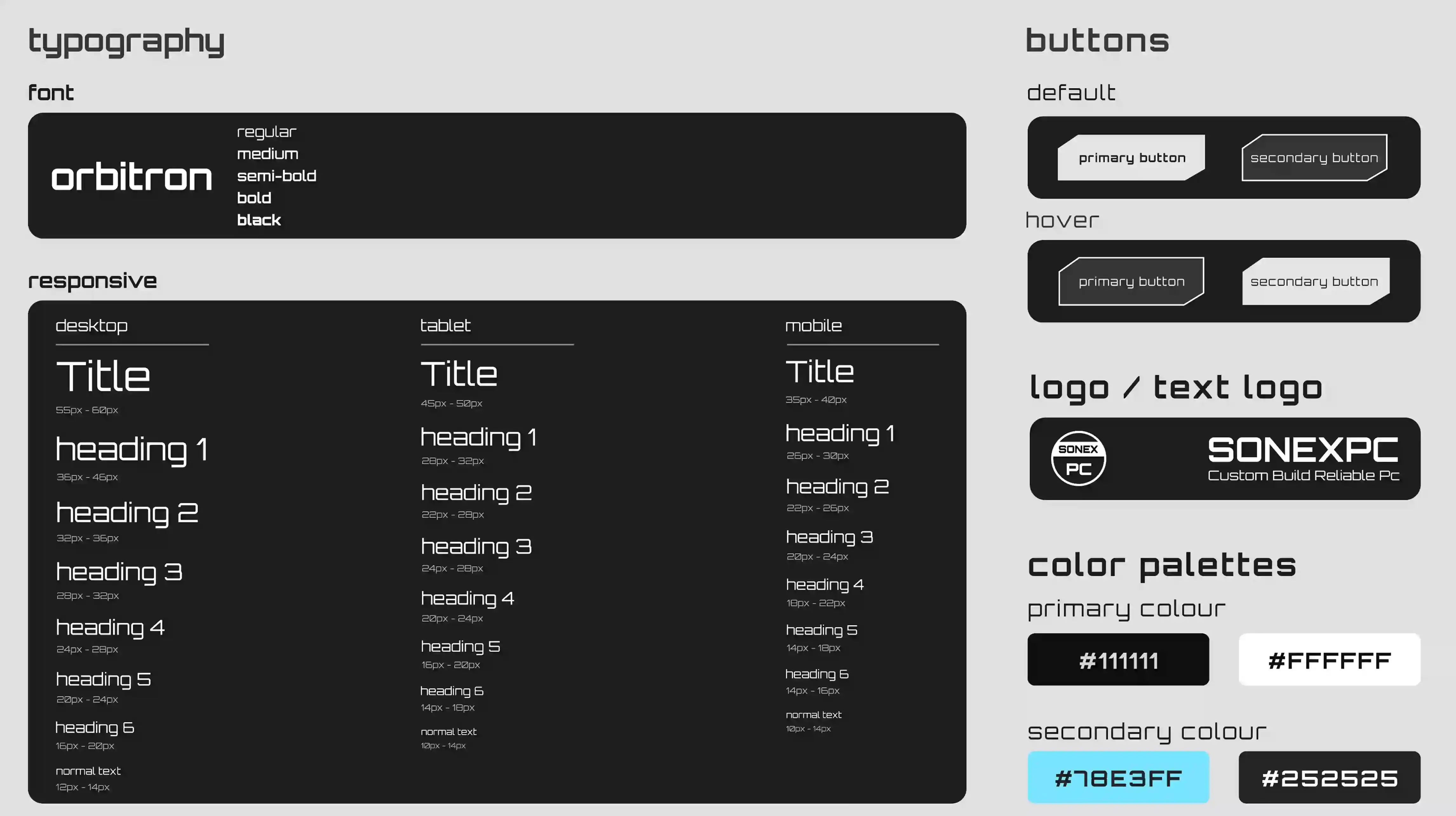
the website has an outdated and inconsistent design system, with a cluttered and unorganized layout. It lacks a clear structure and cohesive style, making it hard for users to navigate and engage effectively.
improving clarity and organization of systems, reducing cognitive load, and creating a cohesive visual style while guiding users toward key actions like contacting the company or requesting a quote.
based on research, I mapped out the website structure and user flows to define clear content hierarchy and navigation. I created a sitemap to organize pages and reduce cognitive load, and low-fidelity wireframes to explore layout, navigation, and key actions with a focus on usability.